Mobile First and Progressive Enhancements with LESS
This is the first in a series of posts on improving developer workflow from my experiences over the past 12 months whilst working with the BBC.
The first in series is a brief explanation on how we’ve tackled implementing a responsive solution that must be accessible and also support IE6+. Early in the process, we settled on the use of LESS as our CSS preprocessor. For those not familiar with LESS, it is a CSS preprocessor which extends CSS by adding features such as variables mixins.
Getting Started
We’ve kept the main less file very simple:
   /**
    * Vanilla
    */
   @import "_variables.less";
   @import "_mixins.less";

   /**
    * Modules
    */
   @import "modules/general/_base.less";
   @import "modules/forms/_base.less";
   @import "modules/header/_base.less";
   ...
   @import "modules/footer/_base.less";

   /**
    * Responsive modules
    */
   @import "_responsive.less";
To start we include LESS files for storing variables and mixins to ensure these are available for the modules that proceed. Following that we include the individual modules, this sets the baseline CSS that is offered to mobile users. Lastly we include _responsive.less which includes all the breakpoints.
The _responsive.less then looks something similar to:
   @media screen and (min-width: @mobile_portrait) {
       @import "modules/header/_responsive-320px-min.less";
       ...
   }

   @media screen and (min-width: @mobile_landscape) {
       @import "modules/header/_responsive-400px-min.less";
       ...
   }

   @media screen and (min-width: @small_tablet) {
       @import "modules/header/_responsive-600px-min.less";
       ...
   }

   @media screen and (min-width: @tablet_portrait) {
       @import "modules/header/_responsive-768px-min.less";
       ...
   }

   @media screen and (min-width : @desktop) {
       @import "modules/header/_responsive-1008px-min.less";
       ...
   }

   @media screen and (min-width : @tablet_landscape) {
       @import "modules/home/_responsive-1024px-min.less";
       ...
   }
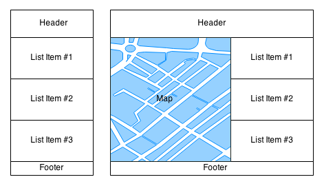
This approach allows us to cascade the styles as the interface becomes more complex for devices with larger displays. The particular breakpoints are based around the a grid that is defined by the UX team. The experience delivered to users on smaller devices is vastly different to those on larger displays. Users with larger displays are offered a map and list, in a split view whilst the devices with smaller displays simply have the list of content. This is demonstrated below in these low fidelity wireframes.
The mobile first approach has approven critical in delivering this enhanced experience. The CSS defined included in app.less defines a baseline and as the device width increases, we can constrain and the enhance the elements on the page. To improve maintainability, we’ve also defined the breakpoints as variables to allow us to easily adjust them if needed in the future.
We’ve taken this approach to reduce the number of media queries. We could have easily had a single less file per module and littered each module with it’s own set of media queries. However, the above approach leads to a single media query for each breakpoint for the whole application and reduce the overall size of the output.
Modular approach
As seen above, we’ve taken a highly modular approach to the problem. This allows us to easily introduce minor changes to individual modules and easily navigate between each module. The folder structure is as follows:
   app.less
   _responsive.less
   modules/
       /header
           _base.less
           _responsive-320px-min.less
       /footer
           _base.less
           _responsive-320px-min.less
           _responsive-600px-min.less
As the product is relatively small, each module mainly appears on the page once. Therefore most modules start with an ID, for example the header module files will start with:
   #header {
       ...
   }
The same selector is applied at the top of each less file for a given module, hence applying the same selector across all breakpoints. For the less specific modules, a similar top level selector is applied. For example:
   .article {
      ...
   }
These top level selectors match the name of the module folder as well.
Progressively enhancing
As explained earlier, we needed to ensure the product degraded gracefully and the content is accessible on IE6 and up. In our particular product, a map appears only on the larger displays. Therefore, we needed a way of delivering the content to those users without creating a flicker when the page first loads. This was achieved using the well documented approach of appending a class to the documentElement using JavaScript in the head of the HTML document.
Once we had a class added to the documentElement, we can then manipulate the content for a particular experience. However, we didn’t want to break how the modules were setup up to achieve this. Using LESS’s ampersand feature to prepend the current selector to the parent this was easy to achieve. For example:
   #header {
     ...
     .js & {

     }
   }
This outputs the following:
   .js #header {
     ...
   }
The product also needs the ability to disable the map feature at any point. Again this was easily achievable with the same approach as above.
   #header {
     .no-map & {
       ...
     }
   }
Supporting older browsers
As there is a need to support older browsers, which do not offer support for media queries, we decided to offer the desktop experience for these browsers. This was relatively easier, we could simply compile the a browser specific stylesheet which contained all the styles across the breakpoints For example, we have a less file ie7.less:
   @import "_variables";
   @import "_mixins";
   @import "_debug";
   ...
   @import "modules/header/_responsive-400px-min";
   @import "modules/footer/_responsive-400px-min";
   ...
   @import "modules/header/_responsive-600px-min";
   @import "modules/footer/_responsive-600px-min";
   ...
   @import "modules/ie/_ie7.less";
This is then included in the head of the document using conditional comments.
Hopefully this quick overview will prove useful to you in your projects as you try to tackle delivering a progressively enhancement, mobile first solution.